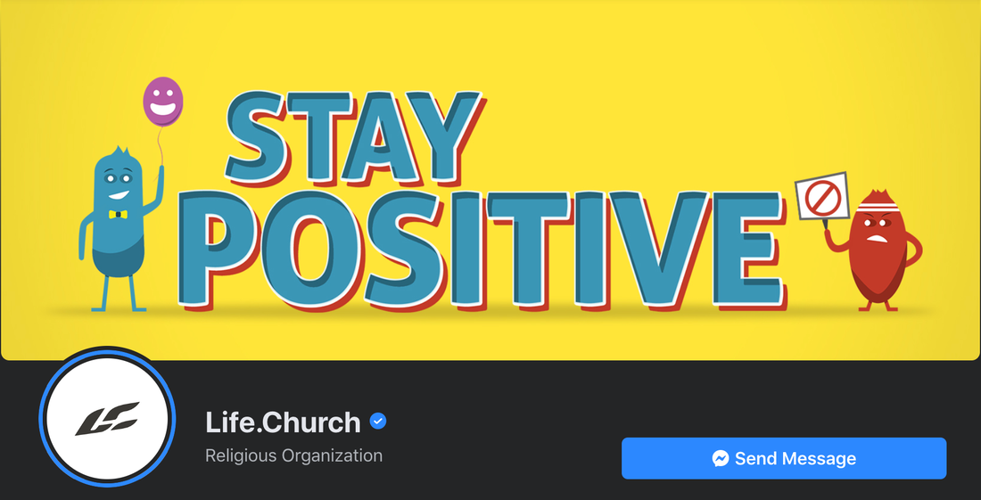
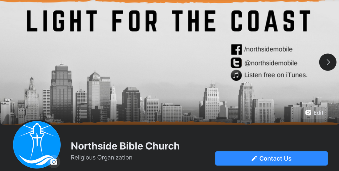
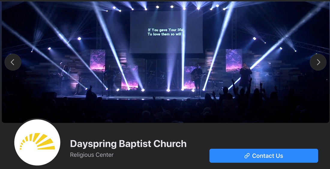
Believe it or not, you can have a killer social media playbook and lose the game entirely.How? By making really simple mistakes and overlooking obvious critical details. One of those is the infamous Facebook cover (or header) photo. If you’ve established a Facebook Page for your church — which is likely where the majority of your congregants are hanging out on social media — then you’ve probably realized the visual nature of this platform by now. Granted it’s not quite like Instagram, where practically everything revolves around photos and videos, but it’s still crawling with people and Pages bent on expressing themselves through graphics, photography, videography, digital art, and more. That’s because most folks, especially brands, know that the quickest way to get your attention in that traffic jam called a “Newsfeed” is to stop your scroll with some sort of visually-appealing, eye-catching, or altogether absurd image or video (or even a meme.) Two or three sentences of text alone just won’t cut it. You’ll whiz right past a chunk of text without a second glance. The same concept applies to the actual Page itself, which in this case translates to the header (or cover) photo. You know the one. It’s that little 820 pixel by 360 pixel snippet of real estate nestled at the top of the Page, just above the profile photo. Research shows that most of your audience won’t actually ever return to your Facebook Page after they’ve liked/followed it. Why? Because they expect to see your posts in their Newsfeed. After all, that was the whole point of liking the Page in the first place. (And let’s be honest: Most of your followers are just too lazy to manually type your Page’s name into the search bar and press “Enter” on their keyboard. Sad, but true.) Once you realize this, it can be tempting to not even worry about creating any sort of header photo/video at all. Why bother going to all that trouble if no one is going to see it, right? Well, not so fast. I’ve watched too many churches make this mistake and it couldn’t be more detrimental to your social media strategy. Your Facebook Page will still be viewed regularly by 1) current church members who need information about a certain event, announcement, etc. 2) potential visitors using Facebook as a search engine to find churches in their area or 3) people who found your church’s website and then clicked on your Facebook social media icon to learn more about you. All three of these audiences are unique and important in their own way. When they land on your Facebook Page, they should be greeted by a crisp, clean, well designed cover graphic/photo (or slideshow of multiple graphics/photos) or a cover video. Here are some quick reasons why this space matters: #1. It's the first thing they will notice. Make it count.Humans are 90 percent visual beings. According to research by 3M Corporation, we process visual content 60,000 times faster than text. If that’s not enough to make your head spin, get this: Over 250 billion photos have been uploaded to Facebook, which equates to roughly 350 million photos per day. This header section is your first — and possibly your only — chance to send a message to a visitor. What kind of message do you want to convey? What kind of impression will they have when they swing by for a few seconds? Will they want to come back? Will they be inclined to learn more about you? How will you visually communicate what your church is all about? And remember — whether we like it or not — the quality and professionalism of our Page will also be judged by what we place here. That might not be fair, but it’s simply human nature. #2. It's a chance to showcase your church's unique atmosphere.The average seeker — or even a longtime believer in search of a new church home — often has one question on their mind before making an in-person visit: “What am I getting myself into?” There are a lot of other questions wrapped up within this question, but you can help to answer a few of them and alleviate some of their apprehension by using your cover photo space to give your Facebook visitors a snapshot preview of the overall ambience and general vibe of your church. Some examples would be: 1) a high-definition action photo or video of one of your worship services encompassing the band and singers on stage as well as some congregants raising their hands in praise; 2) an action shot or video reel that highlights your church’s involvement in the local community; 3) a minimalistic graphic accompanied by your church’s catchphrase/slogan. Red Rocks Church is currently killing it with their video header. Check it out here. Life.Church is always very creative with their sermon series cover photos (See example below.) Check them out on Facebook here. Even small churches can learn lessons from these bigger churches. Keep it simple, clean, and within your abilities to manage. At the small church where I serve as Communications Director, I've currently got three graphics in the slideshow, starting with one that promos our catchphrase and our other social media platforms. (See photo below.) The other two graphics promote our 2020 vision and our current sermon series. A larger Baptist church in my city has a shot of one of their worship services displayed prominently in the slideshow to let folks know about that atmosphere ambiance we mentioned a minute ago. (See photo below.) Whatever you do, don’t showcase your building in your cover photo slot, unless you plan on doing it with a nice high-quality, well-produced aerial video or something like that. And even then, it should be part of a montage that includes footage of your pastor and your people. You know, your actual church. (Take a look at how Brentwood Baptist does theirs.) Most seekers couldn’t care less what your physical building looks like. #3. You can use it to promote sermon series or upcoming events.Although you should primarily use your Events tab to promote your church’s schedule, it’s perfectly fine to advertise a particularly noteworthy event in your cover photo slot — something that is above and beyond the “norm” for your church. For example, if a notable Christian author, speaker, or singer were to make an appearance at your church, you would want to design a customized graphic to display prominently at the top of your Facebook Page for that, in addition to creating/scheduling an actual event on your Page’s Events tab as well. Cover photos are also a great place for promoting your pastor’s current sermon series. Yes, this is perhaps the most common usage of this space. Yes, everyone else is doing it. But, just because they're all doing it doesn't mean you shouldn't. It just means you need to work harder at designing a sermon series graphic that will stand out in the crowd. WHAT ELSE?Of course, this is all just the tip of the iceberg when it comes to creatively using that little rectangle at the top of your church Facebook Page. There are a million other options. What did I leave out? What is your church doing? What has worked for you? What hasn't? Drop some suggestions and thoughts into the comment thread below!
0 Comments
Leave a Reply. |
Archives
March 2024
|


 RSS Feed